Combinational charts
Create multiple layers
Line and Bar
We can configure layers on muze using the layers API.
Let us see how we can combine a line and a bar layer.
Example
const { muze, getDataFromSearchQuery } = viz;

const data = getDataFromSearchQuery();

muze
  .canvas()
  .rows(["Acceleration"])
  .columns(["Year"])
  .layers([
    {
      mark: "bar",
    },
    {
      mark: "line",
      encoding: {
        color: {
          value: () => "red",
        },
      },
    },
  ])
  .data(data)
  .mount("#chart");
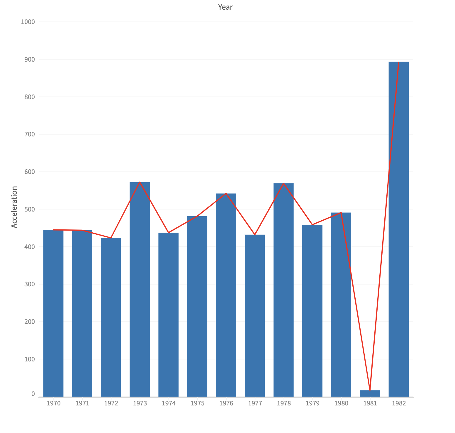
NOTE: Notice how anchors appear on hovering over the line, indicating the value of the Acceleration field.
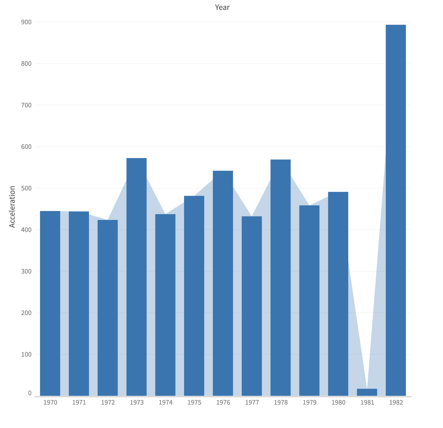
Area and Bar
We just replace the line layer with the area layer.
Example
const { muze, getDataFromSearchQuery } = viz;

const data = getDataFromSearchQuery();

muze
  .canvas()
  .rows(["Acceleration"])
  .columns(["Year"])
  .layers([
    {
      mark: "bar",
    },
    {
      mark: "area",
    },
  ])
  .data(data)
  .mount("#chart");
Changing the order of layers
In the first sample, we defined two layers (bar and line). Notice how the line renders on top of the bar layer (the layer added last comes on top of the previous ones). We can simply alter the position of the layer config in the layers array to change this ordering.
Example
const { muze, getDataFromSearchQuery } = viz;

const data = getDataFromSearchQuery();

muze
  .canvas()
  .rows(["Acceleration"])
  .columns(["Year"])
  .layers([
    {
      mark: "line",
      encoding: {
        color: {
          value: () => "red",
        },
      },
    },
    {
      mark: "bar",
    },
  ])
  .data(data)
  .mount("#chart");
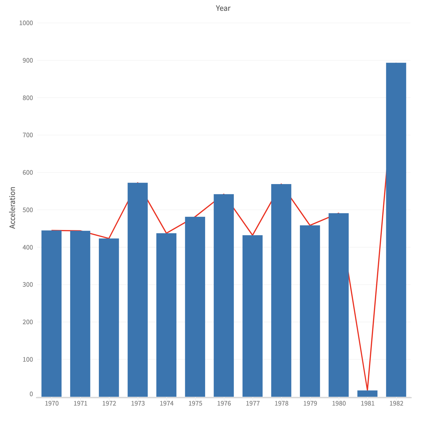
NOTE: Notice that we just swapped the position of the line and bar layers, thus bringing the bar layer on top of the red line.
Creating layers with different data sources
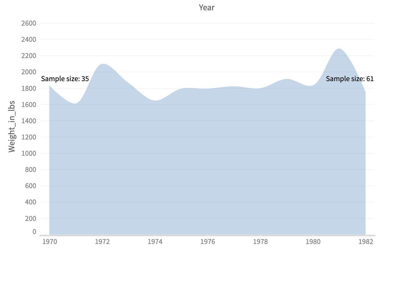
So far we have created layers which are powered by same data source. But there are fair number of use cases where two layer can have two different data source. Say, a visualization which shows change of weight of cars over the year and in the background you have a text showing the sample size of the experiment.
Here, if you notice carefully, you will realize that the are area layer is draw from Weight_in_lbs and Year field, but the text layer is drawn from the a separate data source: number of records in the dataset.
Here, the transform property receives a DataStore instance created by Muze internally. It is a wrapper over DataModel with additional utility functions. We use transform property of Muze to transform the data passed as input to calculate the total sample size. Once the model is calculated assign this calculated model as souce to text layer.
Example
const { muze, getDataFromSearchQuery } = viz;

const data = getDataFromSearchQuery();

let dm = new DataModel(data);

const countDm = dm.calculateVariable(
  {
    name: "Sample Size",
    type: "measure",
    defAggFn: "sum", // When ever aggregation happens, it counts the number of elements in the bin
    format: (val) => parseInt(val, 10),
  },
  ["Name"],
  () => 1,
);

muze
  .canvas()
  .rows(["Weight_in_lbs"])
  .columns(["Year"])
  .detail(["Sample Size"])
  .transform({
    weightChangeModel: (dt) => {
      var dataLength = dt.getData().data.length;
      return dt.select({
        conditions: [
          {
            field: "__id__",
            value: 0,
            operator: "eq",
          },
          {
            field: "__id__",
            value: dataLength - 1,
            operator: "eq",
          },
        ],
        operator: "or",
      });
    },
  })
  .layers([
    {
      mark: "area",
      encoding: { y: "Weight_in_lbs" },
      interpolate: "catmullRom" /* spline */,
    },
    {
      mark: "text",
      encoding: {
        text: {
          field: "Sample Size",
          formatter: (t) => "Sample size: " + t.rawValue,
        },
        color: {
          value: () => "#000",
        },
      },
      className: "summary-text",
      source: "weightChangeModel",
      encodingTransform: (points) => {
        /* Post drawing, position transformation of text */
        points[0].update.x += 25;
        points[0].update.y -= 10;

        points[1].update.x -= 25;
        points[1].update.y -= 20;
        return points;
      },
      calculateDomain: false,
      interactive: false,
    },
  ])
  .data(countDm)
  .width(600)
  .height(400)
  .mount("#chart");
We create a new variable to calculate the total number of cars (sample size) in data, by doing
const countFn = calculateVariable(
  {
    name: "Sample Size",
    type: "measure",
    defAggFn: "sum", // When ever aggregation happens, it counts the number of elements in the bin
    numberFormat: (val) => parseInt(val, 10),
  },
  ["Name", () => 1],
);

const carCountDM = countFn(dm);
All it does is create a new filed named Sample Size and initialize the cell with value 1.
Next, when transform data source is calculated from
.transform({
     weightChangeModel: (dt) => {
      var dataLength = dt.getData().data.length;
      return dt.select({
        conditions: [
          {
            field: "__id__",
            value: 0,
            operator: "eq",
          },
          {
            field: "__id__",
            value: dataLength - 1,
            operator: "eq",
          },
        ],
        operator: "or",
      });
    },
})
Sample Size gets aggregated with function sum giving us the total count of cars. The newly created data source is a named data source. We can access this data source by using weightChangeModel identifier.
The last step is to tell the layer, which data source to use by using the source property. If you don't specify the name of data source then by default Muze assigns the input data source to layer.
There is another property you should know about is encodingTransform. Once data points in layer gets positioned based on planer encoding (x and y) and gets visual representation based on retinal encoding (color, shape, size), you might feel the need to change the calculated values of encoding of a point. For adjustments like this we use encodingTransform. Like, in the above example, we positioned the texts at particular positions in the canvas (slightly shifted horizontally and vertically for better visibility) using encodingTransfrom.